I’ve seen it happen a hundred times. A homeowner spends weeks agonizing over the perfect hardwood floor, finally pulls the trigger on gorgeous white oak planks, then grabs a paint chip at the hardware store on the way home and slaps “Agreeable Gray” on the walls without a second thought. Six months later, they can’t figure out why their beautiful new floors look kinda… off. The room never quite feels right, but they can’t put their finger on why. That’s because they’re missing half the equation in what should be a relationship, not a solo act.
Look, I’m no interior designer. Just ask my wife Andrea, who still brings up the “burnt orange incident” from our first apartment. But after renovating hundreds of homes across the country, I’ve developed a practical understanding of how colors and materials interact, especially when it comes to the two largest surfaces in any room: your floors and walls. Get this relationship wrong, and even expensive materials will look cheap. Get it right, and even budget-friendly options can look like a million bucks.
I learned this lesson the hard way during the renovation of our Minneapolis Tudor. We’d splurged on reclaimed pine flooring for the living room—these gorgeous 12-inch planks salvaged from an old warehouse with a rich amber patina. I was so focused on the installation that I left the wall color decision to the last minute, finally grabbing a can of what the paint store guy called a “foolproof neutral.” Let me tell you, there’s no such thing as foolproof when it comes to color relationships. That allegedly neutral beige turned jarringly pink next to the warm tones of the pine. Not subtle pink—we’re talking “someone snuck a red sock into your white laundry” pink.
Andrea didn’t say “I told you so,” but her raised eyebrow said plenty as we spent a Saturday repainting with a properly chosen green-undertone neutral that made the floors sing instead of scream. Lesson learned: walls and floors are in a constant visual conversation, and if they’re speaking different color languages, your room will never feel cohesive.
So what’s the secret to getting this relationship right? It’s not about following rigid rules like “dark floors need light walls” or using some magic color formula. Instead, it’s about understanding three key principles: undertones, contrast levels, and the directional relationship between vertical and horizontal surfaces.
Let’s tackle undertones first, because this is where most people go wrong. Every color—even white, beige, or gray—has an undertone that falls somewhere on the warm-to-cool spectrum. Warm undertones include yellow, orange, and red, while cool undertones include blue, green, and purple. The trick is identifying these undertones and making conscious decisions about how they’ll interact.
My client Jessica learned this the hard way when she installed new “greige” ceramic tile in her kitchen, then painted the walls what she thought was a complementary warm white. The result was a disaster—the tile looked muddy and dull, while the walls took on a sickly yellow cast. The problem? Her “greige” tile had cool blue undertones, while her “warm white” walls had yellow undertones. These competing undertones were visually fighting each other.
The fix was simple once we identified the issue: we repainted with a clean white that had the slightest blue undertone, instantly harmonizing with the tile. The new paint color wasn’t dramatically different on the paint chip, but the effect in the room was night and day. Jessica’s “meh” kitchen immediately felt intentional and polished.
Here’s a practical tip for identifying undertones: never look at a sample in isolation. Always compare it against a pure white background and alongside other samples. Those subtle undertones become much more obvious when you can see the differences between, say, three different “white” paint chips—suddenly one looks clearly more yellow, another more pink, and another more blue-green.
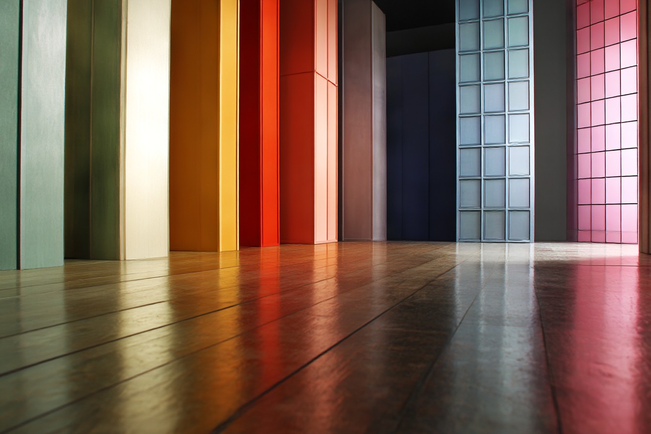
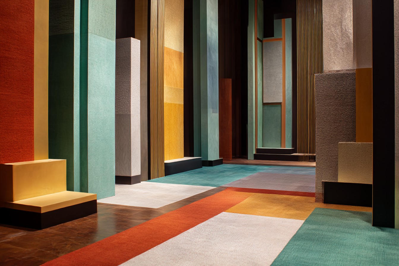
The second principle is contrast level. This is about how much visual difference exists between your walls and floors. High contrast (like dark floors with white walls) creates a more formal, dramatic look. Low contrast (like medium-toned floors with similarly-valued walls) feels more subtle and enveloping. Neither approach is inherently better—it’s about the mood you want to create.
My brother Dave and his wife renovated their 1960s rambler last year and installed beautiful dark walnut floors throughout. Their first instinct was to paint everything bright white for that popular high-contrast look they’d seen all over Pinterest. It looked great in photos, but in real life, the contrast was almost jarring—especially with their north-facing windows that never got direct sunlight. The space felt cold and somewhat unwelcoming despite the warm wood tones.
After living with it for a few months, they repainted with a soft ivory that reduced the contrast just enough to make the space feel more cohesive. The walnut floors still pop beautifully, but the room no longer feels like it’s divided into stark opposing elements. It’s a subtle change that made a huge difference in how comfortable the space feels.
The third principle—and the one most professionals instinctively understand but rarely explain—is the directional relationship. Floors and walls don’t just sit next to each other; they literally meet at a 90-degree angle, which affects how light reflects between them and how colors visually blend in your peripheral vision.
I saw this play out dramatically in a sunroom addition we completed for clients in Arizona. They had chosen a beautiful travertine floor in a warm honey color and wanted walls that would make the space feel bright but not stark. Our first sample—a clean white with the slightest warm undertone—looked perfect on the paint chip and even on our test board. But once we painted an entire wall, something odd happened: the lower portion of the wall took on a distinct golden glow, almost as if we’d painted it a different color.
This was the directional relationship in action. Light was bouncing off that honey-colored floor and reflecting onto the walls, essentially casting a warm filter over the lower portion. Instead of fighting this effect, we embraced it, choosing a wall color that intentionally complemented this warm reflection. The result was a space that felt naturally sun-drenched and harmonious even on cloudy days.
Now, how do you apply these principles when making your own selections? Start with your fixed elements—usually the flooring, since it’s typically more expensive and disruptive to change than paint. Identify its undertones by comparing it to other similar options. Is your “brown” hardwood actually orange-brown, red-brown, or yellow-brown? Is your “gray” tile actually blue-gray, green-gray, or purple-gray? This will be your foundation.
Next, decide on your contrast approach based on the feel you want in the space. For a calm, subtle look, choose wall colors that are similar in value (lightness/darkness) to your flooring. For a more dynamic, defined look, increase the contrast. Just remember that extremely high contrast can create a visual choppiness that makes spaces feel smaller, while too little contrast can make a room feel flat and undefined.
Finally, always test your wall color in large swatches—at least 2×2 feet—on multiple walls of the room. Check them at different times of day, since natural light drastically affects how colors read. Pay particular attention to how the color looks near the floor, where that directional reflection comes into play.
Some practical combinations that consistently work well:
For warm medium-toned wood floors (like oak or pine), walls with subtle green undertones create a natural, harmonious feel without fighting the wood’s inherent warmth. Benjamin Moore’s “Pale Oak” is a go-to in this scenario.
For cool gray or blue-toned flooring, walls with the slightest blue undertone keep the space feeling crisp without becoming cold. Sherwin Williams “Snowbound” is nearly white but has just enough coolness to complement rather than fight gray flooring.
For very dark floors (like walnut or dark-stained oak), avoid pure bright white on walls, which creates overly harsh contrast. Instead, soft whites with a hint of warmth create distinction while maintaining cohesion. Benjamin Moore’s “Swiss Coffee” hits this sweet spot.
For multicolored natural stone or patterned tile floors, pull your wall color from the most recessive color in the pattern, not the dominant one. This creates depth without competition.
Some combinations to approach with caution:
Gray walls with warm-toned wood floors often create a disconnect unless the gray has compatible warm undertones. Most “cool grays” fight with traditional oak or pine flooring.
Very dark walls with very dark floors can create a cave-like effect unless the room has abundant natural light and generous dimensions.
Pure bright white walls with natural terracotta or warm-toned tile can create a stark contrast that makes the floor look more orange than intended.
I’ve found that the most successful spaces aren’t those that follow rigid color rules but those where someone has thoughtfully considered the conversation between surfaces. My neighbor Susan isn’t a design professional, but she created one of the most beautifully cohesive homes I’ve visited simply by laying out all her material samples together in natural light before making decisions. Her engineered oak floors with subtle gray undertones are perfectly complemented by walls in a soft taupe that picks up those undertones without matching them exactly.
“I just kept putting samples next to each other until they looked right together,” she explained when I complimented her choices. That intuitive approach, guided by seeing materials in relationship rather than in isolation, often leads to better results than following formulas.
When Andrea and I tackled our bedroom remodel last year, we spent more time on the floor-wall relationship than on any other design decision. The original 1930s hardwood floors had developed a rich amber patina we wanted to preserve rather than refinish away. After testing literally a dozen paint samples, we settled on a muted sage green that complemented the floor’s warmth while adding a natural, restful quality perfect for a bedroom. It wasn’t a color either of us would have picked from looking at paint chips alone, but in relationship to our floors, it created exactly the atmosphere we wanted.
The wall color-flooring connection might not be the most exciting aspect of home design, but getting it right creates the foundation for everything else in your space. It’s like a good marriage—when the relationship works, you might not immediately notice why, but you definitely feel that something is right. And when it doesn’t work, well… no amount of fancy furniture or accessories will quite fix it.
So before you grab that paint sample on your way through the hardware store, take a moment to consider what your floors are saying and how your walls might answer. Your home’s largest surfaces deserve a thoughtful conversation, not an awkward blind date. Your eyes (and your design-savvy friends) will thank you.