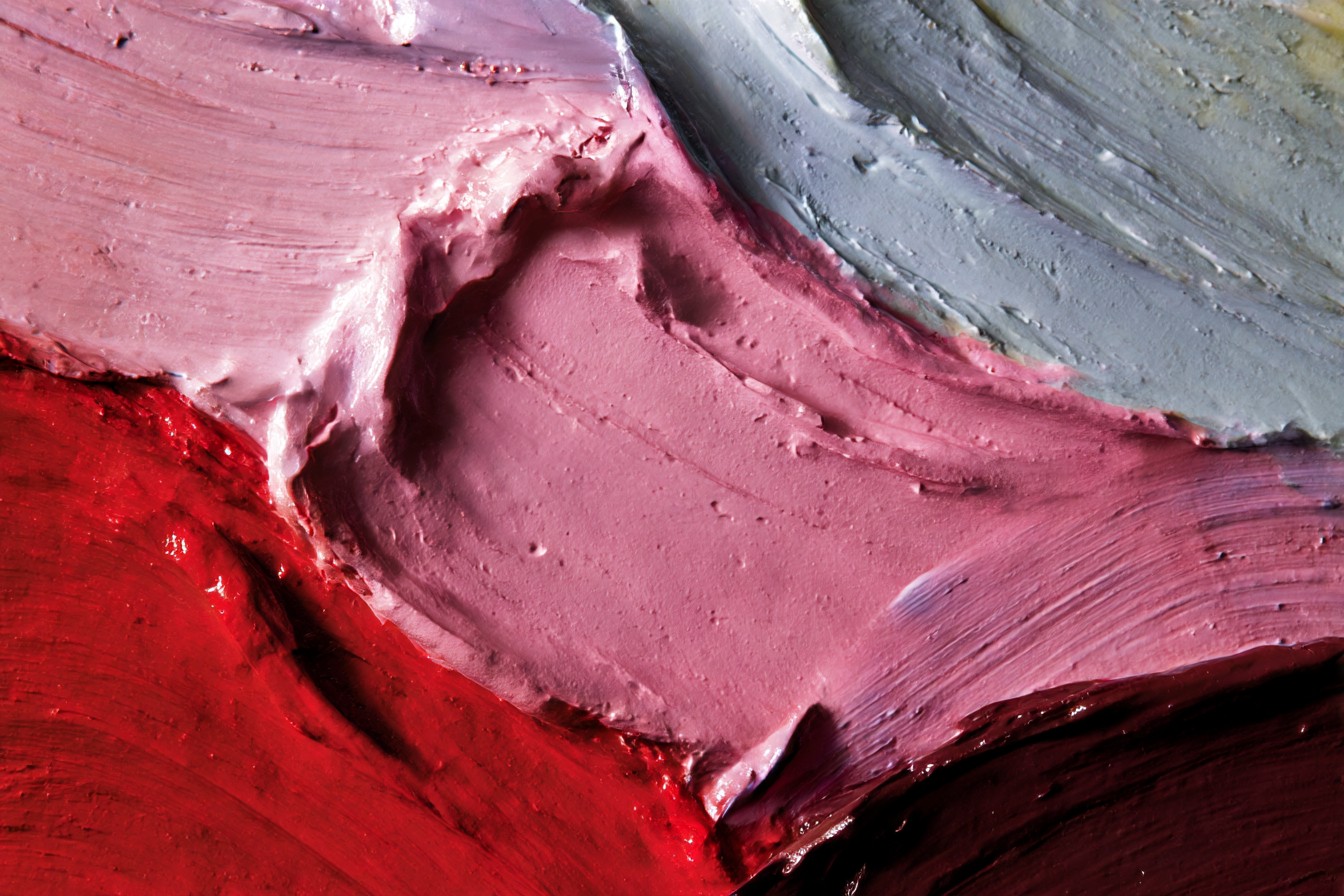
I once spent an entire Saturday watching my friend Melissa cycle through what felt like a nervous breakdown over a paint color. She’d chosen a gorgeous blue-gray for her living room that looked perfect on the paint chip and downright magical on her north-facing test wall at 10am. By 4pm, that same “perfect” color had morphed into something that—and I’m quoting her here—”looks like dirty gym socks soaked in sadness.” Been there. Haven’t we all?
Let me tell you something about paint that the fancy design magazines gloss over—it’s basically a shape-shifter. That pristine “Simply White” that works beautifully in a sun-drenched California bungalow might look like the inside of a refrigerator in a Minnesota apartment during our 8-month winter. I’ve seen grown adults (myself included) stare at walls at different times of day like they’re witnessing some kind of supernatural event. “It was greige this morning, I swear! Now it’s…purple? How is it purple?!”
After 15 years of renovation consulting across just about every climate zone in America, I’ve developed what Andrea calls my “paint color security blanket”—a collection of shades that simply do not misbehave, no matter what kind of light you throw at them. These aren’t necessarily the trendiest options, mind you—that sage green everyone’s slapping on their kitchen islands this year isn’t making my list. These are the steady workhorses that haven’t let me or my clients down across different house styles, room exposures, and lighting situations.
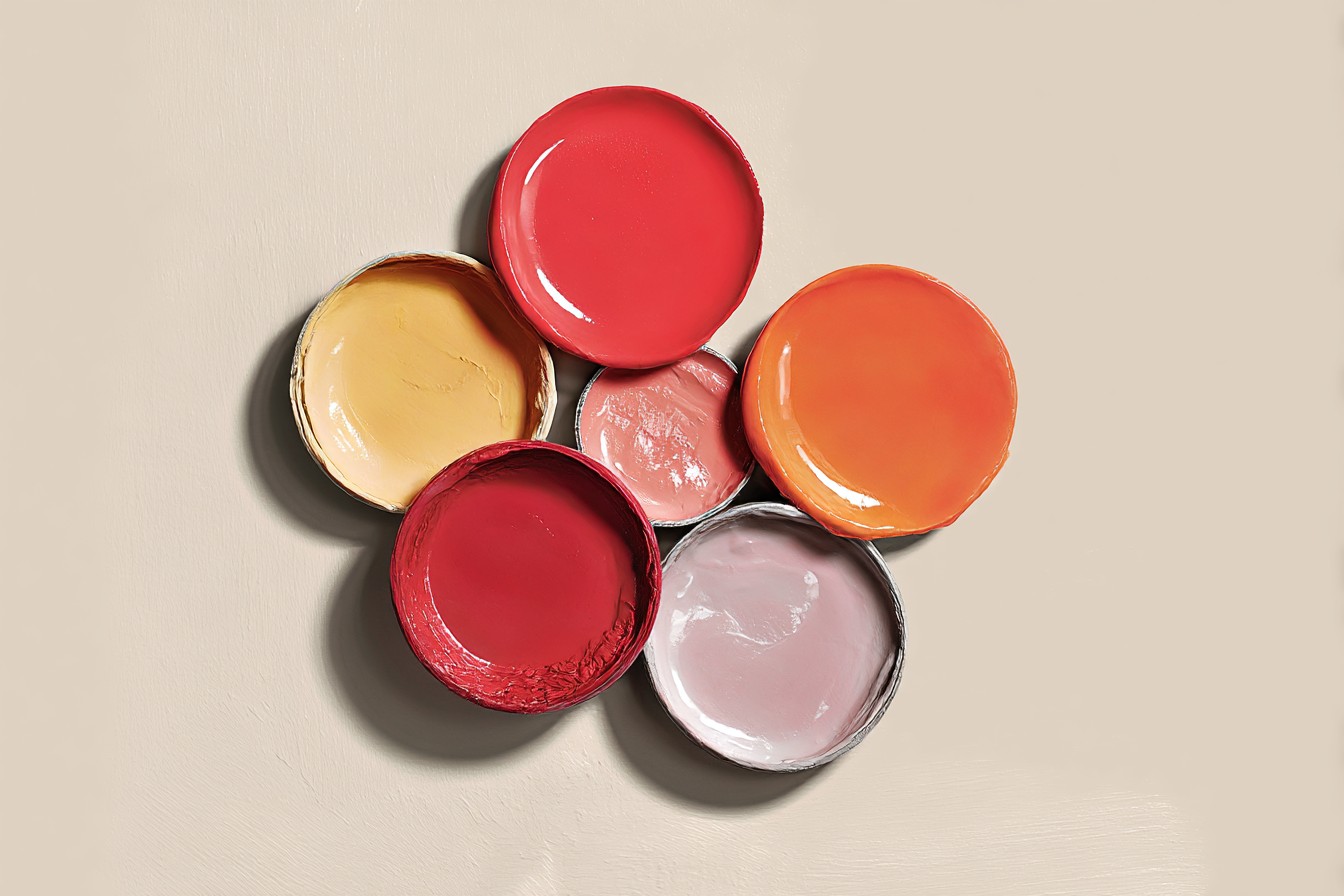
Let’s start with neutrals because, honestly, that’s where most paint disasters happen. You wouldn’t think something called “beige” could cause marital discord, but I’ve mediated enough couples’ arguments in Home Depot’s paint aisle to know better.
Benjamin Moore’s “Revere Pewter” is probably the color I’ve specified most often in my career. It’s technically a light gray with warm undertones, but here’s what makes it magical—it doesn’t suddenly turn baby blue when the clouds roll in or go muddy green under fluorescent lights. I used it throughout my sister’s 1980s colonial in Milwaukee, where it balanced the northern exposure of her living spaces without feeling cold. That same color looked equally good in my client Tony’s south-facing San Antonio ranch house, where many grays would’ve washed out to nothing in that intense Texas sunlight.
“But Mike,” you might be thinking, “warm gray sounds boring.” Look, sometimes boring is exactly what you want from your wall color—something that plays nice with your furniture, art, and the constantly changing light instead of competing for attention or morphing into some weird color you never signed up for.
For spaces where you want a true neutral without the risk of it going pink (and boy, do some beiges love to surprise you with their secret pink agenda), Sherwin-Williams “Accessible Beige” is my go-to. Despite the incredibly unsexy name—I mean, really, who aspires to “accessible” anything?—this color has saved countless renovation projects. It reads as a soft, warm neutral in virtually any light without veering yellow, green, or pink. I used it in a 1940s Cape Cod in Connecticut where the living room had exposures on three different sides, and it remained consistent throughout the day.
For white walls (which aren’t actually as easy as you’d think—ask anyone who’s suffered through “why is my white paint suddenly yellow/blue/green?”), Benjamin Moore’s “White Dove” has gotten me through dozens of projects unscathed. It’s got just enough warmth to keep it from feeling sterile in cool northern light but not so much that it yellows in warm southern exposures. When Andrea and I renovated our Minneapolis Tudor, we used it on all the living space walls to brighten rooms that had been smothered in heavy 1970s wood paneling. The previous owners had tried a stark white that made the rooms feel like operating theaters—cold and clinical against the original dark wood trim.
Speaking of our Tudor renovation, let me tell you about my relationship with Sherwin-Williams “Urbane Bronze.” If I were forced to pick just one darker neutral for the rest of my career, this complex grayish-brown would be it. We used it on our built-in library shelving, and it somehow manages to look sophisticated in morning light, cozy at midday, and downright dramatic at night without ever skewing too cool or warm. It’s become my fallback for nearly any interior accent where black would be too harsh but gray would be too dull.
For actual colors beyond neutrals, finding chameleon-proof options gets trickier, but I’ve got a few that haven’t failed me yet. Benjamin Moore’s “Palladian Blue” is a soft blue-green that stays true in different lights instead of flipping between decidedly blue or definitely green depending on the time of day. I used it in a beach cottage renovation in Cape Cod where it looked crisp and clean in the bright daylight but still retained its color on overcast days rather than turning drab and lifeless like many coastal blues can.
For something with more punch that doesn’t become radioactive in strong light or disappear in dim conditions, Sherwin-Williams “Naval” is my reliable dark blue. I installed it in a dining room in a Chicago brownstone with both gas lighting fixtures and tall eastern exposure windows, and it maintained its rich navy character from morning coffee through dinner parties. Many dark blues either wash out to purple in certain lights or go so dark they read as black—this one stays honest.
Green is probably the trickiest color family to get right because greens are notorious light-shifters. After some spectacular failures (including an unfortunate 1990s forest green incident in my first apartment that looked like a pool table under lamp light), I’ve found Benjamin Moore’s “October Mist” to be surprisingly stable. It’s a soft, slightly gray-tinted sage that doesn’t suddenly transform into mint ice cream or army drab as the light changes. I recently used it in a sunroom restoration in a 1920s bungalow in Portland that faced west, and it maintained its gentle green character from morning through the golden hour of sunset.
Now, I’ve gotta address the paint sample situation because it’s where most people go wrong. Those little paper swatches? Basically useless for predicting real-world results. Even those small sample pots don’t cut it if you’re just painting directly on different walls. Here’s what actually works—get a couple of those large poster boards from the dollar store, paint them completely with your sample colors, then move those boards around the room at different times of day. Check them against your existing furniture, floors, and trim too, because colors don’t exist in isolation.
Last year, I helped my brother-in-law with his first home, a quirky 1960s split-level in St. Paul with the strangest lighting conditions I’d ever encountered—the previous owner had installed skylights alongside original fluorescent kitchen fixtures and amber-glass pendant lights. Talk about a color-shifting nightmare. We tested eight “fool-proof” grays that had worked in dozens of previous projects, and seven of them variously appeared purple, green, or blue depending on the time of day and which Frankenstein lighting fixture was turned on. The only one that remained stable was Sherwin-Williams “Mindful Gray”—another one for my never-fail list.
One last piece of advice that’s saved more projects than I can count—buy a sample of your chosen color and your backup choice even after you’ve made your decision. Nothing’s worse than getting halfway through painting your living room at 9pm before realizing it’s absolutely, definitely not working, the paint store is closed, and you’re stuck sleeping in a room the color of, well, dirty gym socks soaked in sadness.
The truth about paint is that regional light varies dramatically across America. The quality of sunlight in Maine isn’t the same as New Mexico. Northern light isn’t the same as southern exposure. Morning light differs from afternoon. Add in the variables of your specific fixtures, bulb temperatures, and how colors reflect off your floors and furniture, and it’s no wonder people get overwhelmed. These reliable shades have become my safety net across different homes, different regions, and different lighting challenges. They might not be the most exciting colors on the fan deck, but they’ll save you from that unique despair of realizing your carefully chosen paint color is gaslighting you every time the sun moves.